
Some reflections on Thunen Symposium on Soil Metagenomics
I was grateful to be invited to Braunschweig as a keynote speaker at the Thunen Symposium on Soil Metagenomics this week. It was a real privilege to have this opportunity to get more up-to-date with many frontiers in soil science and to be brought into the discussion on analysis.
Nevertheless, I heard a lot of frustration from (often junior, often from non-EU or -US institutions) folks with trying to navigate which of the myriad tools to use for analysing sequencing data. I can talk for hours and write hundreds of pages about what I think are the best tools for relative abundance, diversity, network estimation & pangenomic analysis, but I think basic principles are more important. This post is intended to lay out some of these principles -- I hope it's helpful. Some related slides are here, and they contain more links.
Disclaimer: This post contains opinions. These opinions are mine, and mine alone; feel free to disagree.
Interpret your data in context
At this conference I gave a talk on this paper, where Michael McLaren, Benjamin Callahan & I showed that sequencing microbial communities does not give you an accurate picture of microbial community composition (even for the simplest communities). Does that mean that we shouldn't sequence microbial communities? Of course not! Sequencing gives us amazingly rich information about microbial communities. However, sequencing abundance profiles can be misleading for the microbial community abundance profiles. I encourage you to talk about relative abundance of reads, but not relative abundance of microbes in communities. We can bake some of this into our science communication: instead of "the response of soil microbiomes to X", consider talking about "changes in microbial sequencing profiles of soil with X". This isn't a perfect fix, but it's a start.
I'm also a little tired of hearing supercilious comments about different sequencing technologies. Reality check: 16S sequencing sequences 16S sequence variants. Shotgun sequences short reads -- sometimes you can reconstruct partial genomes (MAGs), sometimes you can reconstruct genes. Long read sequencing sequences longer reads -- potentially telling you about repeating/hypervariable regions. I think Mike Lee does a great job of emphasising that *different* technologies give you *different* pictures of the community (check out his blog & resources!). One is not better than the other for answering an arbitrary question. Let's consider the question when deciding on technology.
Be a decent person
I also find it classist when folks who have access to shotgun sequencing make fun of folks who only have access to 16S sequencing. Shotgun sequencing is more expensive, and so more available to folks from wealthier institutions and better funded labs. Therefore, please avoid snide comments about 16S -- even if 16S sequence variants don't help you answer *your* question.
Show me your data
There are two plots that are very popular in microbiome science that I wish were relegated to supplementary materials or omitted: ordination plots, and bar plots. My objection is common to both: they obscure your data.
Ordination plots
If you don't know what these are -- great! A reminder for those who do -- this plots a low-dimensional projection (or transformation) that maximises the variability/separation between samples.
David Clausen plans to go into some problems with ordination in a future post, so I'll instead suggest a better way to show me what you observed: Identify what aspect of the community is changing, and show me how it's changing. If you care about relative abundance of reads mapping to a sequence variant, gene, or genome, show me how read relative abundance changes... and show me those error bars. For example, here's how the relative abundance of reads with Massilia 16S sequence variants changes with forest fires (Data from Whitman et al 2019):
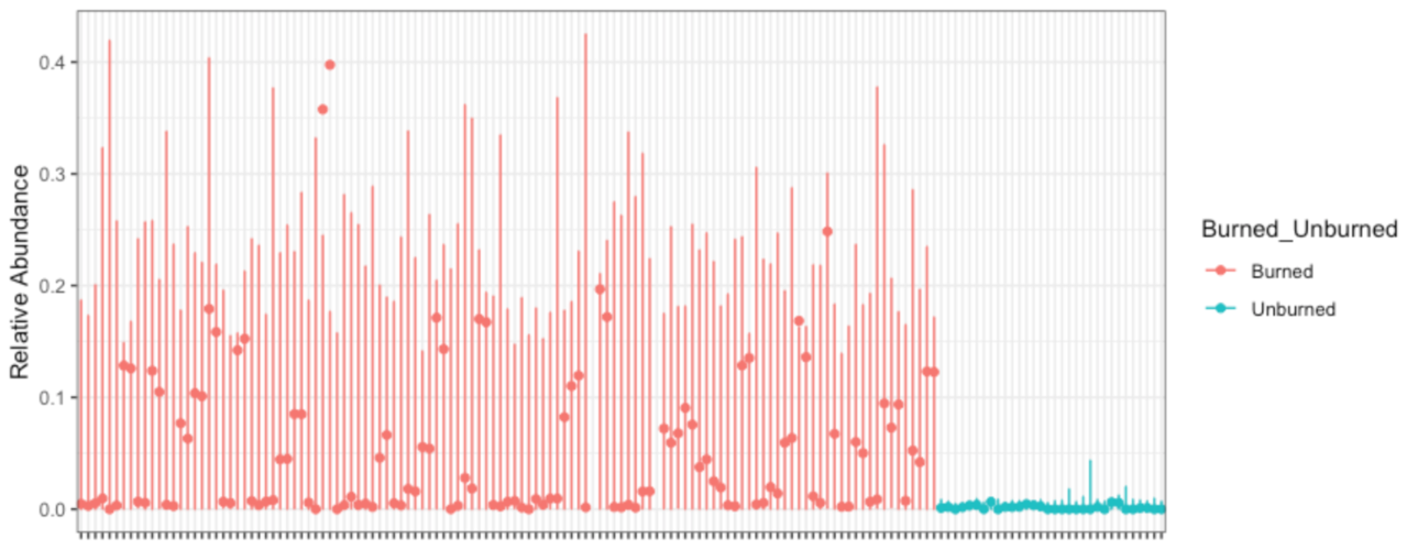
I could make this plot better in many ways, but here's what I like: you can see what's on the x-axis (samples), y-axis (16S read relative abundance) and color (burned/unburned). You can see the error bars implied by my fitted model (corncob); they seem reasonable to me. You can see what feature changes, and by how much. I could tile 4 of these in the same area as an ordination plot... and the ordination tells me nothing about what *specific* feature of the community is changing.
I know reviewers and advisors often ask for these plots, so if you have to provide them, put them in Supplementary Material, spend <1 minute talking about them in talks, and don't do a hypothesis test to see if the picture is "significant"... more details on this in a future blog post from David!
Bar plots
Do you have multiple measurements of something that's always positive? Biomass weight/density? CO2 flux? DNA concentration? Great! I want to see it.
Here's the same data shown two ways -- thanks to Rafael Irizarry and Michael Love for their excellent book chapter on this:


The left plot obscures you data, while the right plot shows your audience how much deviation there is around the mean. If there are outliers, which there often are, you can hide them in a barplot but not in a scatterplot. (That's what's really scary to me when I see a barplot.)
Bottom line: If you use data to make a conclusion, please show me that data.
Choose a scatterplot/jitterplot over a bar plot, and ask your colleagues to do the same.
Statisticians are not the enemy, nor the gatekeeper
I can't speak for all statisticians, but my personal mission as a statistician is to facilitate science via the scientific method. I advocate for reproducible and replicable science, and evidence-based decision making. I try to organise everything I do around this goal.
My impression is that folks equate statisticans to Reviewer #2 -- someone who doesn't like your work and doesn't want it published. If a paper's data supports the conclusions that were drawn, and that conclusion is important or interesting, then I usually support publication. However, if the conclusions are overstated, if the data doesn't support the conclusion, or if the authors don't show me how the data supports the conclusions, then anyone (statistician or not) has the right to object. (That said, I probably wasn't your reviewer.)
I think it's actually more common for non-statisticians to complain about your statistical methods, because (1) there are many more non-statisticians than statisticians, and (2) statistical methods are often an easier target for criticism because knowledge of context isn't necessary to criticise methods. I encourage editors to ask reviewers "Does the authors' data support their conclusions?" rather than "Did they use the best methods to analyse their data?" Assessing what is the best analysis method is usually impossible and definitely unreasonable/unscalable (because it requires someone to reanalyse all the data).
Let's not let perfection prevent progress.
More coming soon...
I have lots of opinions about analysing microbiome data, and many of them are in my lecture notes for STAMPS 2019 and this folder of talks that I've given. However, that may not be the most digestible format, so I'll try to slowly communicate them through this blog. In the meantime, good luck with your reasonable, ethical & rigourous microbiome science... and happy holidays!
Amy Willis, 13 December 2019
(with thanks to Jacob Price, Bryan Martin, Pauline Trinh & David Clausen for their helpful suggestions & edits)

